Last winter, it was gray and gross for a really long time. Or at least it felt like a really long time. Mostly because it’s always gray and gross all winter here so I can get kind of cranky.
Since petting fabric always makes me feel better, I started pulling springy fabrics out of my stash to try to break the mood. Then I decided to try some improv, but rather than just haphazardly making cuts, I gave myself a few rules… I had been watching Cheryl Arkison’s “Improv With Intention” classes on Creative Live, after all. Here were my rules:
- 3 colors (poppy red, citron, spring green) and a background (white/off-white)
- Cuts had to be straight and square cuts, and all measurements had to be in 1/4″ increments
- Skinny (1/2″ finished) strips had to be solid or tonal prints.
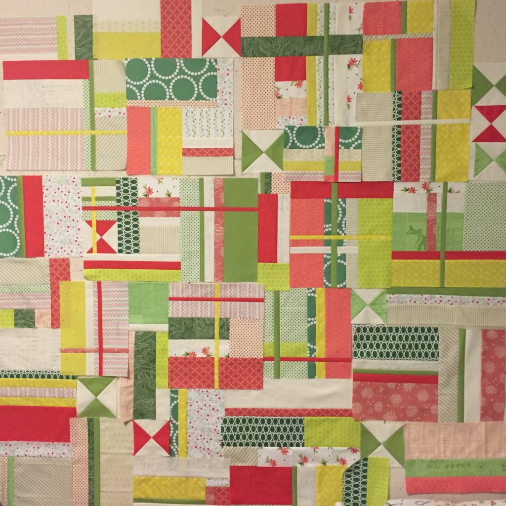
After one night of playing, here’s what was up on my wall.
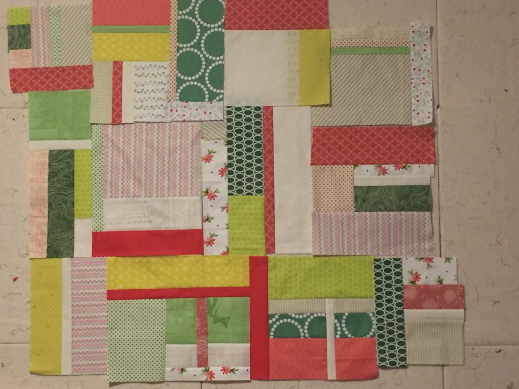
I was having a blast, so I kept going, pulling more and more fabrics from my stash that worked in this colorway.
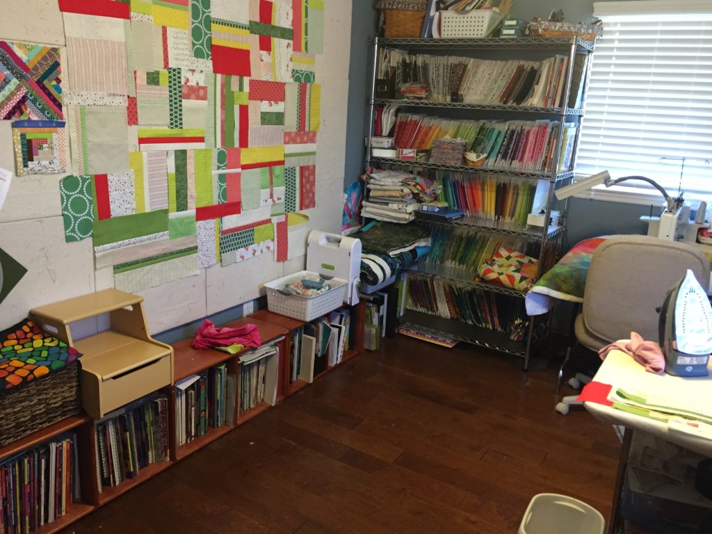
Already, the winter doldrums started to feel a bit better and my sewing room looked springy!
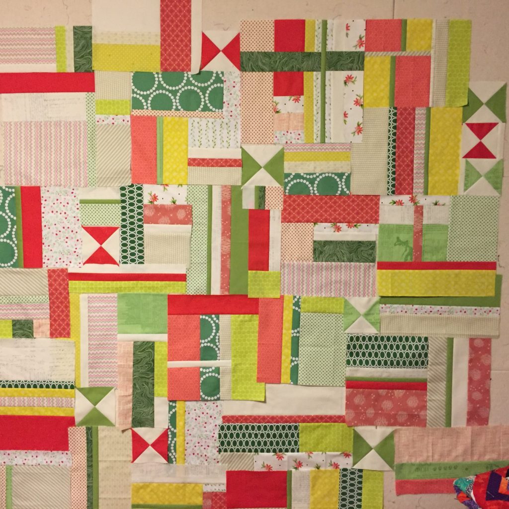
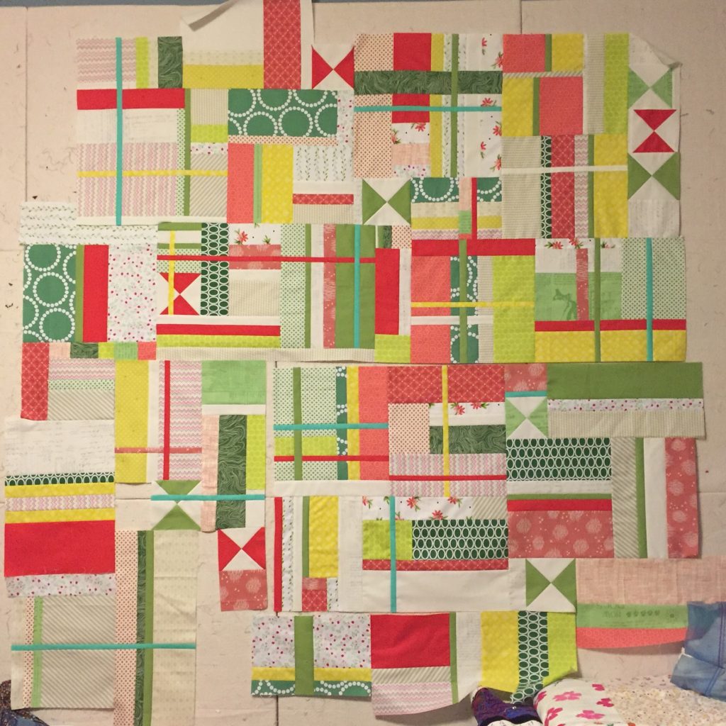
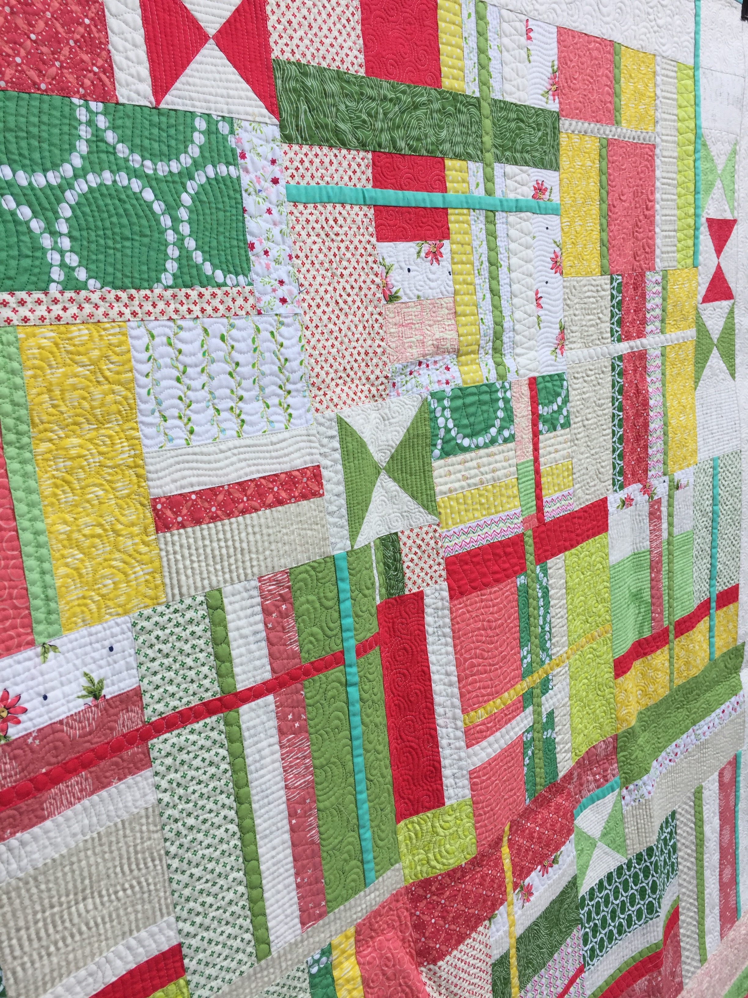
Of course, since I can’t leave well enough alone, I decided that I might want a sparing scattering of diagonal lines to give the piece some extra motion. I made a few to see how they worked with the rest of the composition, and liked the result, especially since there weren’t very many of them.
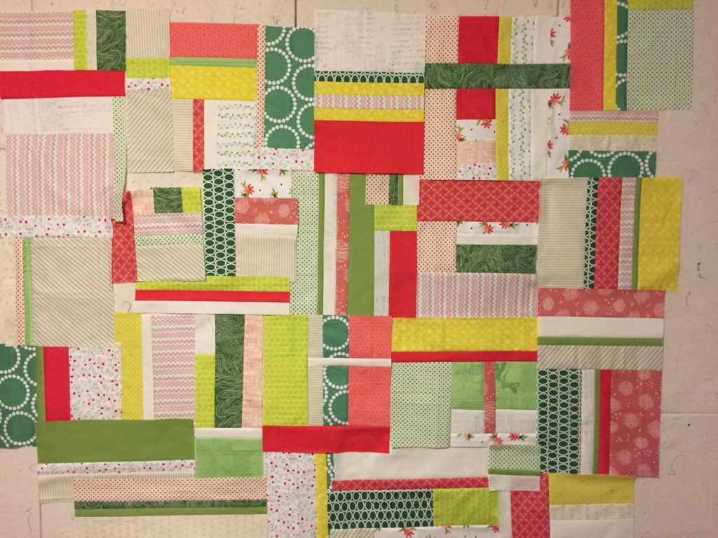
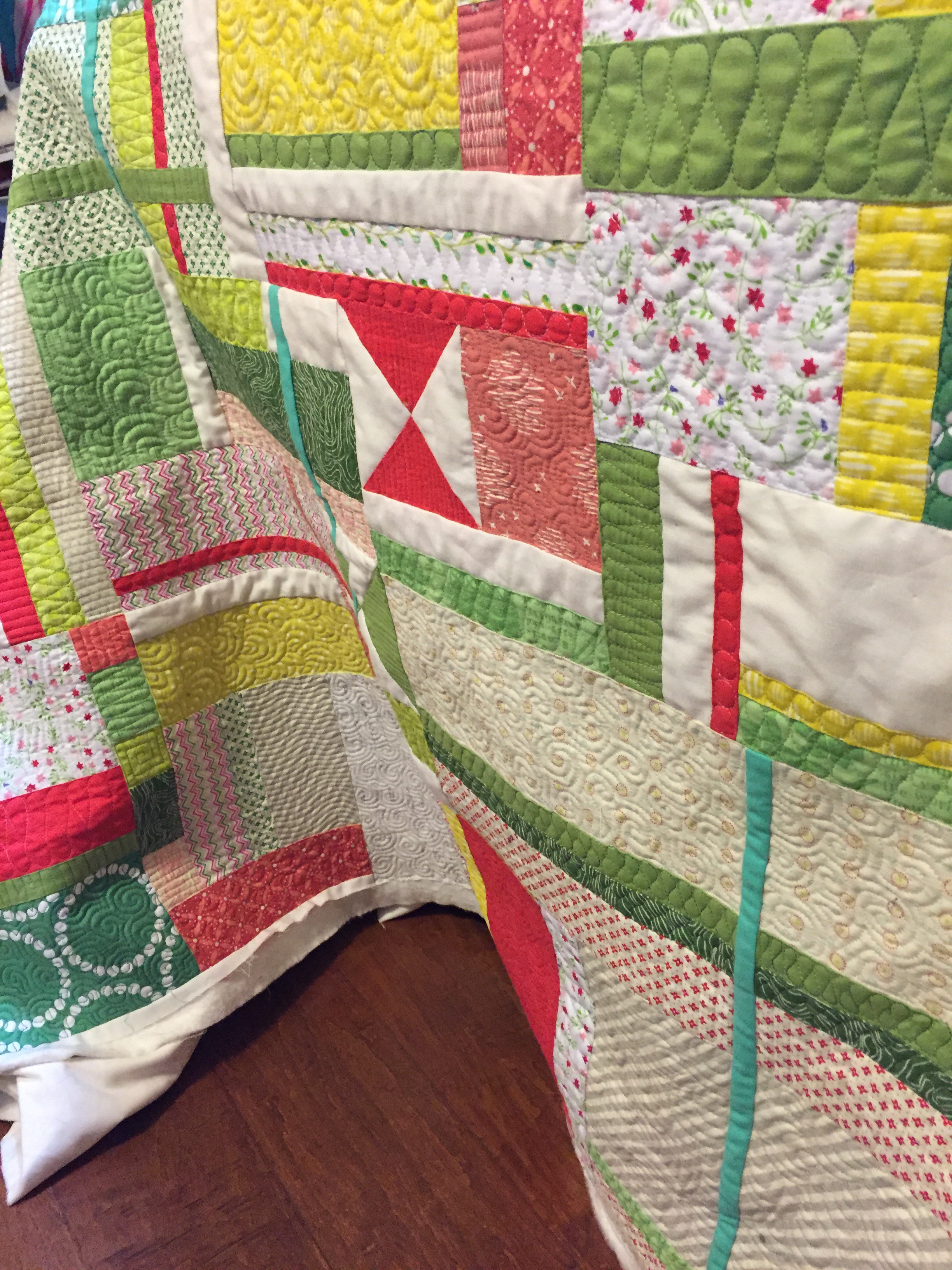
A few more evenings of work and rearranging, and it was starting to find some structure and cohesiveness, but I was finding the color palette to be a little too limiting.
My solution was to add some skinny strips of aqua fabric to break things up, but again, I didn’t want to add too many because I didn’t want them to take over. I liked the result much better.
Then it was just a puzzle of partial-seam constructions and careful measuring to keep everything squared up as I assembled the pieces together. There’s only one bizarre Frankenseam in there where I had to pretty much make ritual sacrifices to get it all put together, but I couldn’t even tell you where it was now.
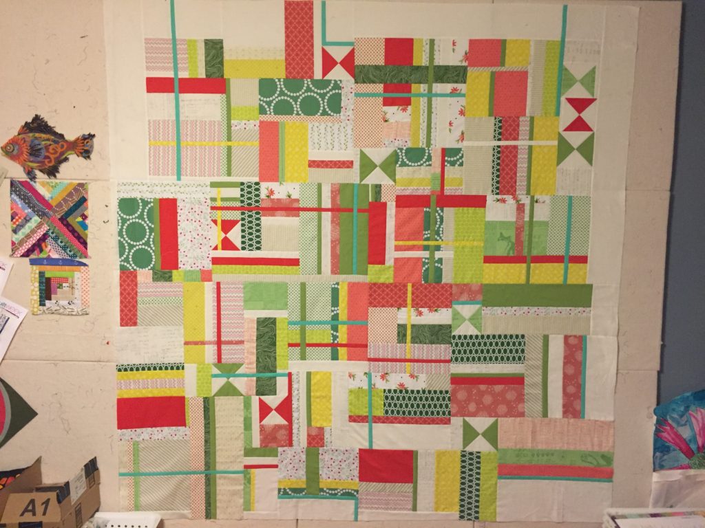
Once I had the middle of it all assembled, I left town for a school trip. When I got back, I added some more of the background color and extended a few of the blue strips into the border to give some visual relief to the piece.
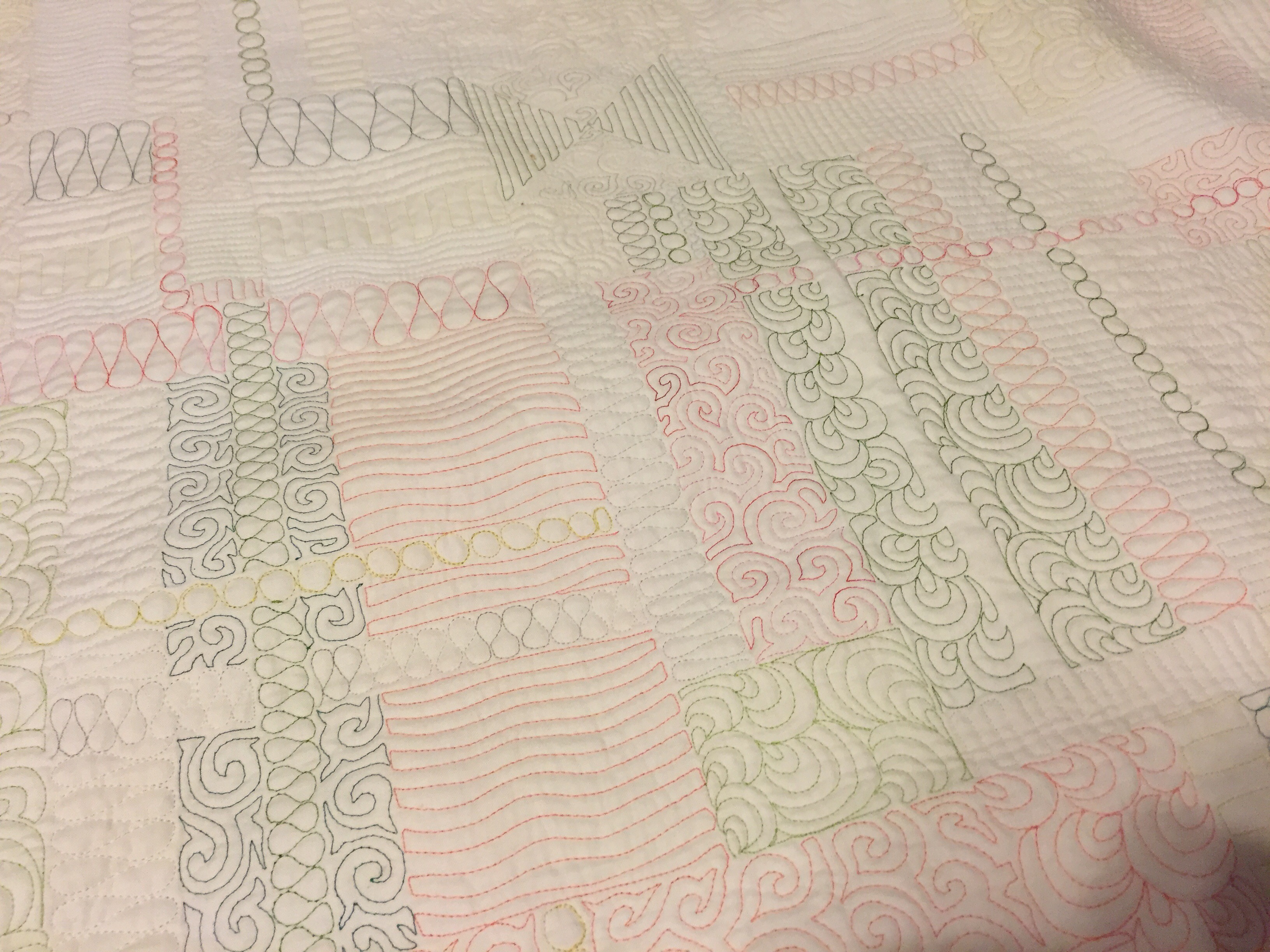
I wanted to quilt it densely in such a way that the piecing was featured, but the quilting was an extra treat if the viewer got close to it. So I made rules for the quilting, too — just so I wouldn’t be paralyzed by indecision when I was ready to quilt.
- Prints were quilted with matching solid threads (exception: darker green prints were quilted with variegated thread because I didn’t have the right color solid thread)
- Solids were quilted with matching variegated threads
- Aqua strips were left unquilted
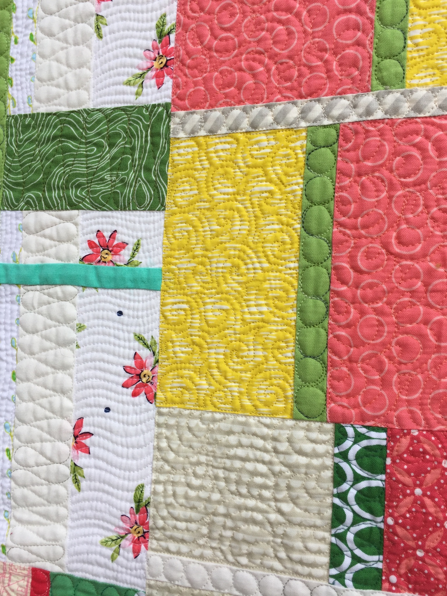
- I also limited myself to a handful of free-motion fillers: hook swirls, pebbles, wavy lines, ribbon candy, and headbands
- Adjacent sections wouldn’t have the same quilting design if it could be avoided
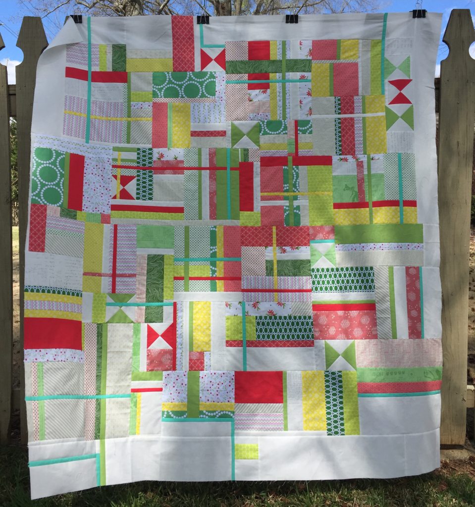
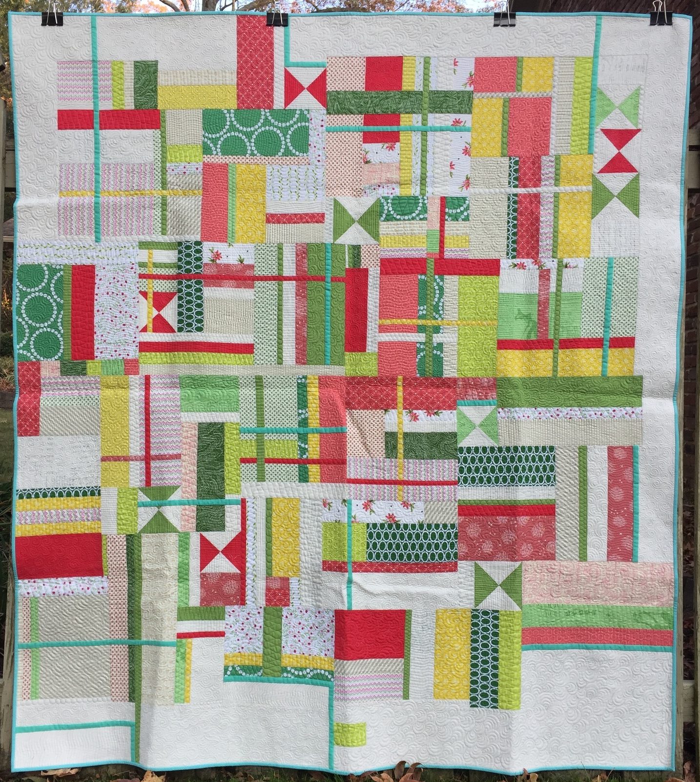
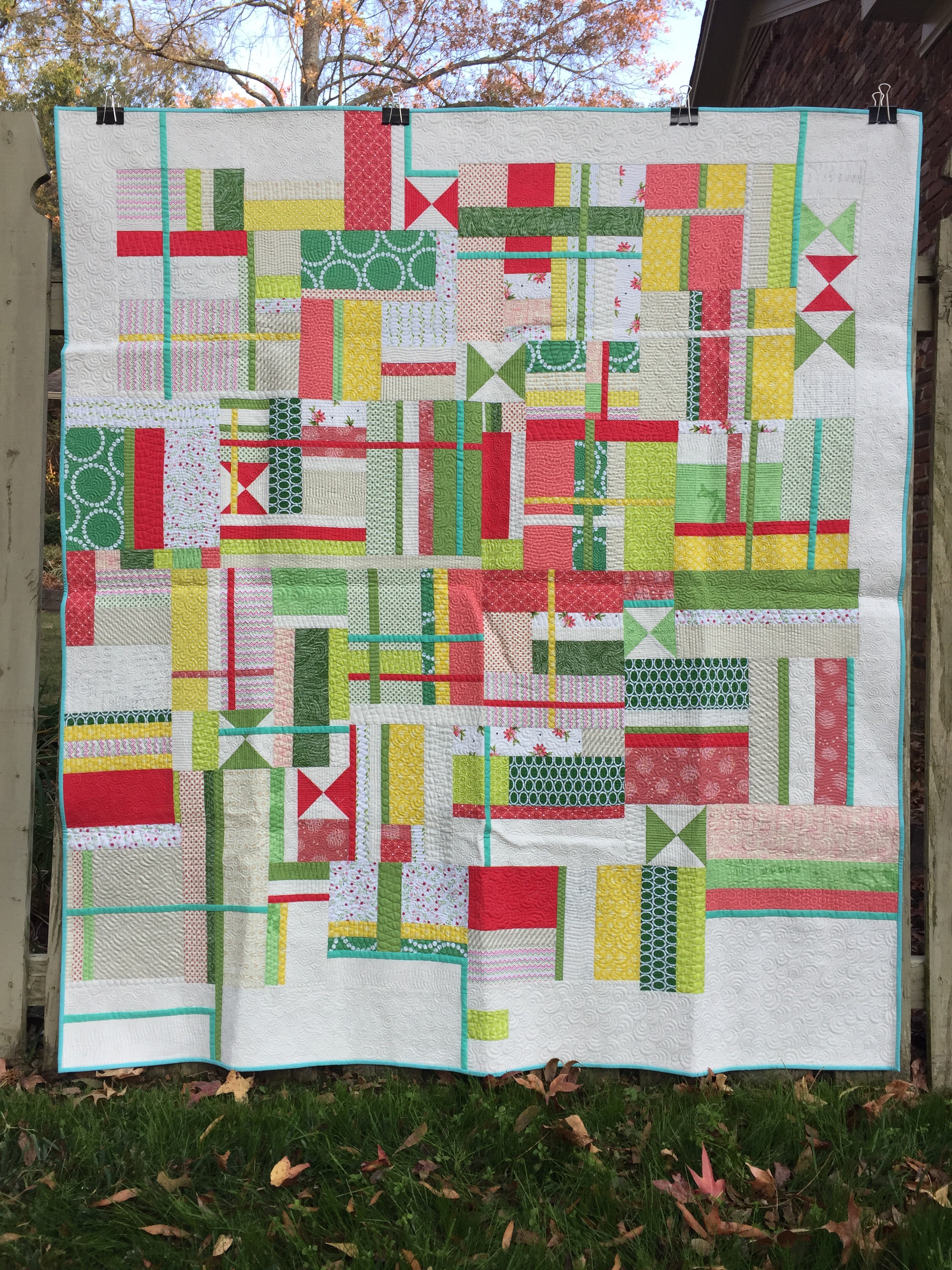
I bound the whole quilt in an aqua print to match the skinny solid strips, which framed the finished composition nicely.
Here are a few closeups of the quilting process as I was going along. The hook-swirl filler is one of my very favorites, because I’m able to keep the swirls a consistent size and I’ve gotten pretty good about self-correcting my path so I don’t get trapped in corners. I buried all threads at the edges of the sections rather than traveling to the same color along seamlines. I also didn’t stitch in the ditch anywhere (and actually, when I’m quilting densely like this I usually don’t bother since I’ll be hitting the ditch about every 1/4″ anyway).
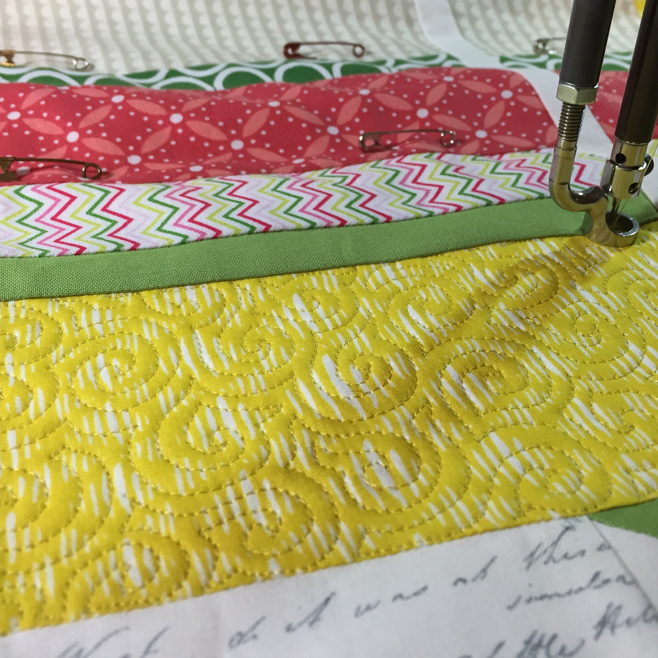
I pin-basted the quilt a lot, so I was able to jump around and quilt different sections without changing thread colors until I was ready. Each night I’d fold it back up on my quilting table, and it was fun to watch it get thinner as the batting compressed under the quilting stitches.

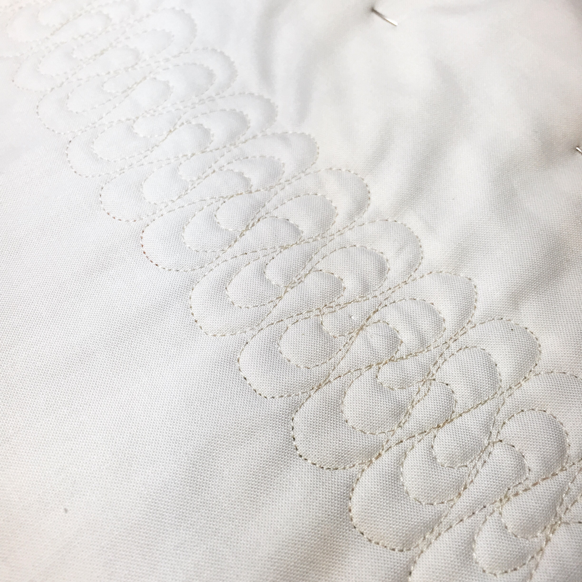
I even experimented with my tried-and-true Ribbon Candy fill in a few places, just to combat boredom or fill in a too-large-scale section. I loved how this triple ribbon looked on the back of the quilt in a variegated cream/beige thread.
Because of the density of the quilting, it became very obvious which sections remained to be quilted as I got further and further along.
Matching the bobbin thread to the top thread meant that the back of the quilt was just as interesting to look at as the front, for different reasons. It also helped me check for density changes that I might want to fix.

I like the back almost as much as the front.
I love this quilt, even though the whiteness makes it totally impractical for use as a throw. But it sure is pretty — on both sides!
Here’s a look at the front again…
3 Responses
What a great quilt! I like the idea of setting rules to work within for improv – sounds like it would make it easier to find a starting spot.
Absolutely wonderful! The back of the quilt is such a treat. I honestly never thought about bottom bobbin color before.
https://shorturl.fm/OPRkc