[Last finish of the quarter for my Q2 Finish-Along Goals.]
(Lots of pictures again… I wanted to remember how I did this so I took tons of photos of each step of the process of making this quilt — and the experiments that led to it.)
Five or so years ago, I happened upon the website of Natalia Guravlik, an extraordinarily talented quilter in Russia. Her work with symmetry and complex quilting and trapunto techniques often makes me gasp, and I’ve bookmarked more than one of the posts on her “Master Class Techniques” tab (the third tab from the left side). I’ve followed her blog since before Google Reader ended… so it’s been a while. In August of 2012, she posted this tutorial, which showed how to get a fully-symmetrical design using a square of freezer paper folded on the diagonal. My two semesters of Russian in college didn’t really help me translate much of her written instructions, but it didn’t matter. Her photos were so good (and I’ve been following her posts for long enough) that I was able to figure out what to do.
I decided to work on a smaller scale, and have the entire project be the size of a square of 18″-wide freezer paper, since I wasn’t sure how well it would work and I didn’t have the funds at the time to buy fabric for an experiment since we were in the middle of rebuilding our house.
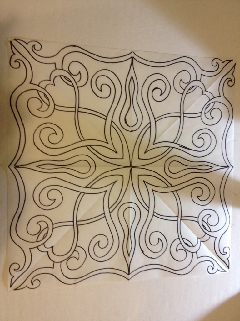
Using freezer paper, a pencil, a lightbox, and a Sharpie, this is the design that I came up with. What I thought was especially cool about her process is that by going over the diagonal for part of the design, sections overlap and it’s easy to recreate the overlaps as you transfer the image to the fabric.
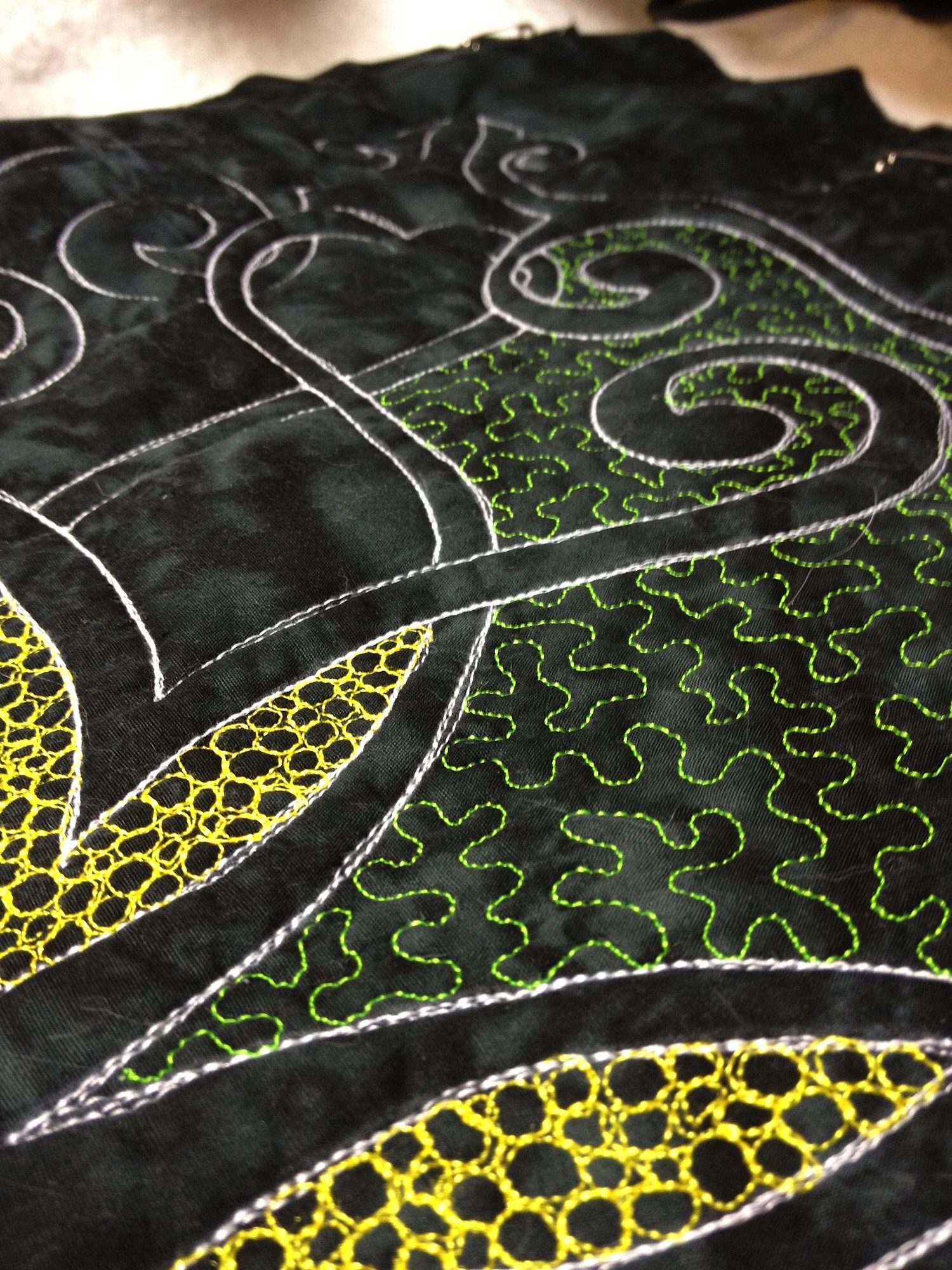
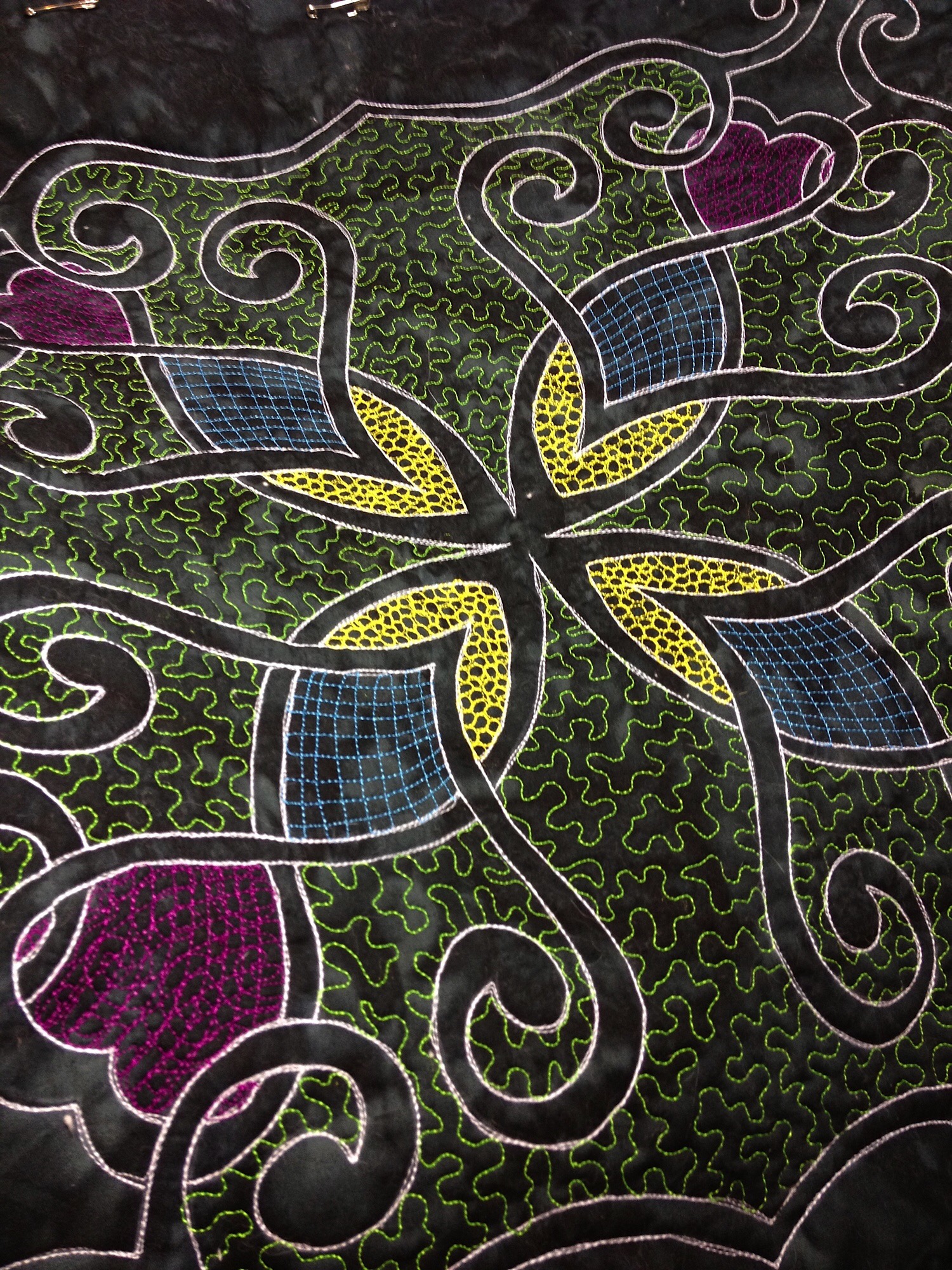
Next, I ironed the shiny side of the freezer paper to the back of a piece of mottled black fabric that I had in my stash. Using a chalk pencil (and the lightbox), I transferred the design to the front of the fabric and removed the freezer paper. Next I layered the fabric, batting, and a backing of more of the black fabric, and pinned it well. With white thread, I outlined the design three times with free-motion quilting. I didn’t worry too much about having all of my outlines perfect, because I knew that small imperfections just show that this was hand-guided and not done by a computerized quilting machine.
For this piece, I chose to fill in the background behind the design with filler designs, since that is what I had admired so much in Natalia’s designs. I chose brightly colored rayon threads for sheen and just had a good time. This was the weekend that Jerry was convalescing after having to have his clavicle reassembled, so I needed to stay in the house in case he needed anything. It was a great project to work on because the scale of it was small enough that it wouldn’t take long for me to get to a point where I could stop and attend to him.
Before long, the entire 18″ piece plus a border had been quilted, and I declared it finished. I was so pleased with how it turned out!
Huntsville Ballet Company had a silent auction fundraiser that year, so I donated the piece to that event and it sold. I have no idea who has it now, but I’m glad I have my pictures of it. I don’t think I actually got a photo of it finished, though.
Since then, I’ve really wanted to make another whole-cloth quilt, but on a larger scale. So last fall I ordered a large chunk of 108″ wide black Moda Bella fabric from Fat Quarter Shop, planning to make something around 72″ wide that could hang in our dining room. Then I made a cutting error when I was preparing to layer the fabric with the batting and backing, so I had to change plans and design a smaller quilt. Ultimately, I’m kind of glad I messed up. This project was intimidating, so being forced to go smaller was probably good for a first effort.
As always, Friday helped.
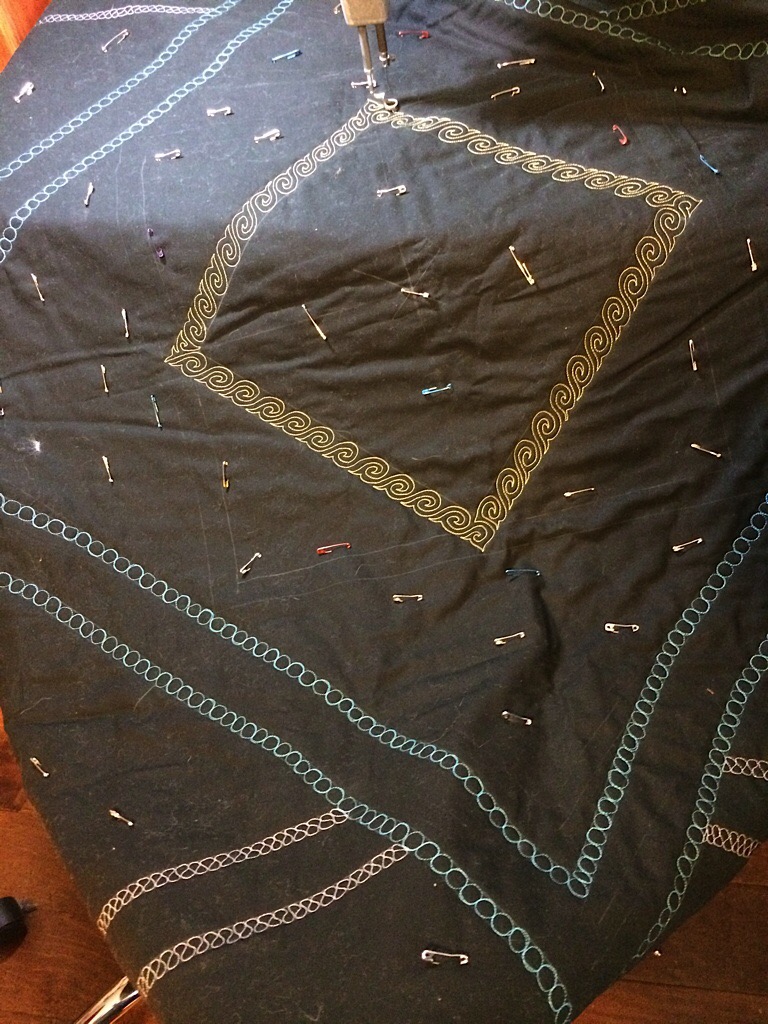
Once I had the quilt sandwich laid out, I got out my rulers, measuring tapes, and chalk marking out the perimeter of the quiltable space and the exact center. Then I placed a square in the center, and started drawing around it. I knew that if I tried to make a rectangular shape and then quilted heavily out near the edges, it would be very difficult to get the finished piece squared up at the end. So I opted instead to go for diamonds, elongated triangular shapes, and other types of symmetry that would be more able to trick the eye. After all, I knew that I would be free-handing this and imperfections would be part of the experience.
I didn’t sketch any of this out before chalking it on the fabric. I just let the length of the rulers that I had available drive the width of sections, and marked out the divisions of the various sections of the quilt. Then I sat down and quilted those boundaries with threads that had a good contrast with black — but no white this time.
If I was dissatisfied with the weight of a color, then I added more to it to make it have more power. If my tension wasn’t right, I picked it out and quilted it again. Turns out that certain colors of my thread — and these were all the same brand and weight of thread — required looser tension. Strange, but true. Variegated threads in particular.
Once I had all of the sections partitioned off, I was baffled. What do I do now? Should I just fill them in with random doodles?
Flashback to last summer… I happened upon another website of another talented quilter, Karlee Porter, who does amazing work with what she calls graffiti quilting. I had played with some of her design ideas on a small piece last summer, before I bought the big chunk of black fabric, mostly to see what these bright Aurifil threads would do on black. Since my original symmetric piece had been done with rayon threads (which are prone to shredding, and which I didn’t have enough of to do a full-size quilt anyway), I wanted to see if I could achieve similar drama using my beloved cottons.
I was thrilled to learn that YES, when the tension is set perfectly, the cotton threads are every bit as powerful as the rayons. I doodled random designs in every thread color that I had, all over this half-yard piece of fabric. I *loved* how the variegated threads looked but knew that they’d pull attention from anything symmetric that I wanted to do, so I’d need to use them sparingly.
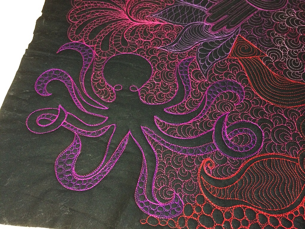
I posted a picture on Instagram, and someone requested an octopus. So I found a stock image of an octopus and recreated him.
Here’s Friday with the completed piece, before I cut it apart and made it into a laptop sleeve for Jerry to take on a trip with him.
So… back to the big black piece of fabric that has now got me completely intimidated… I dug around in my sewing room and located the original piece of freezer paper from 2012.
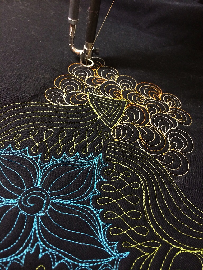
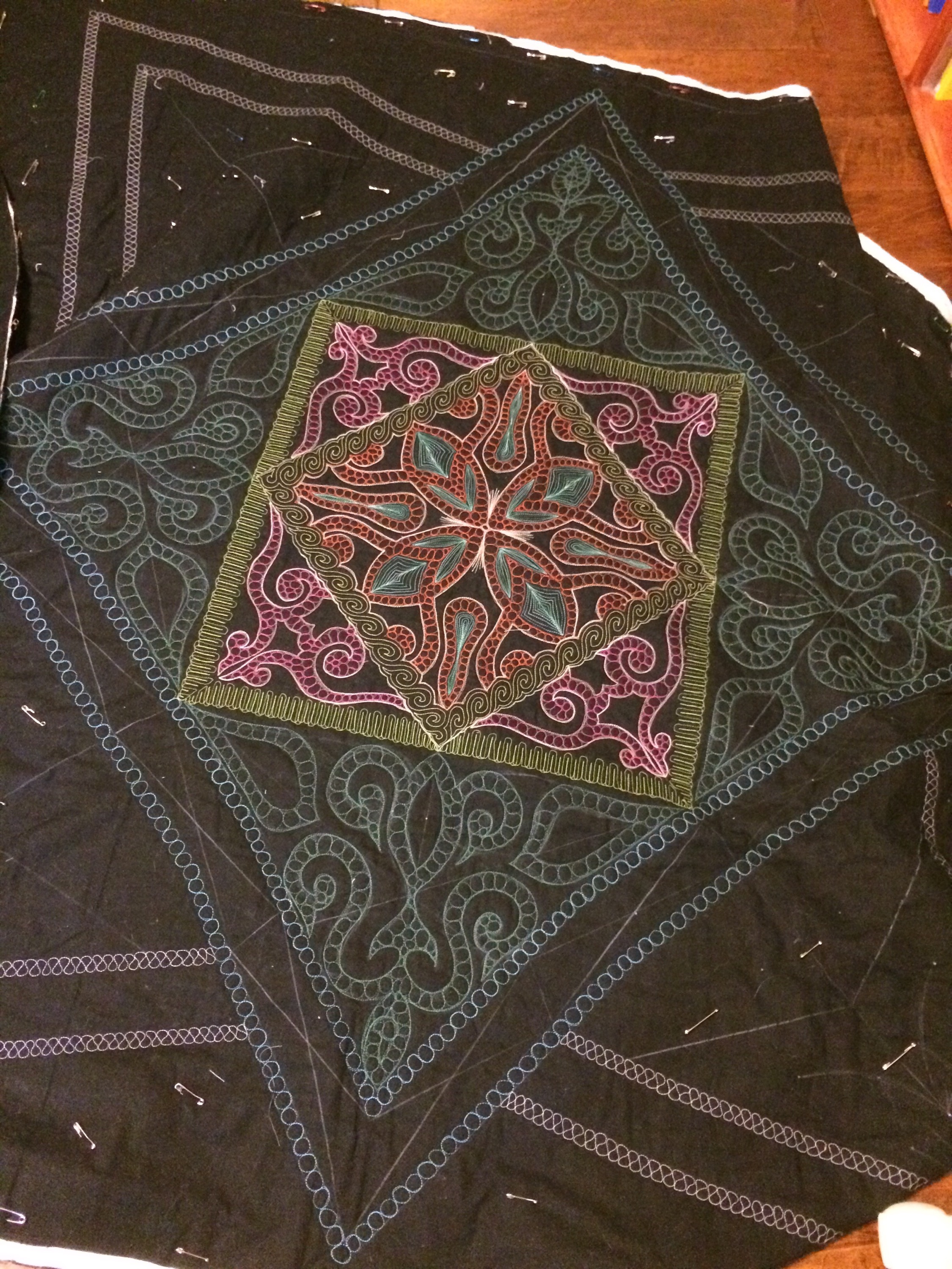
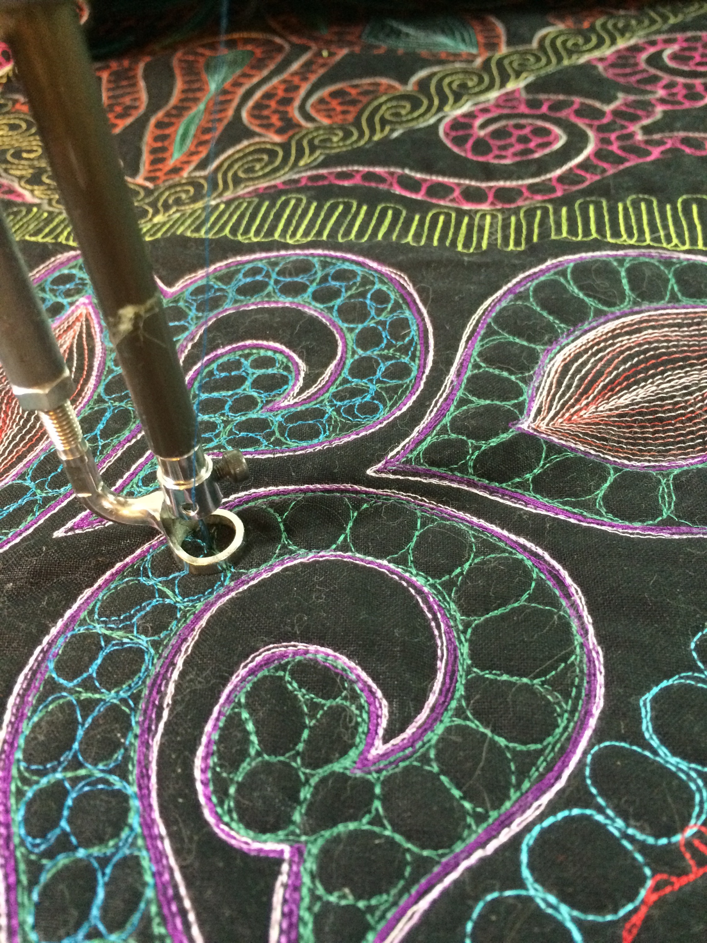
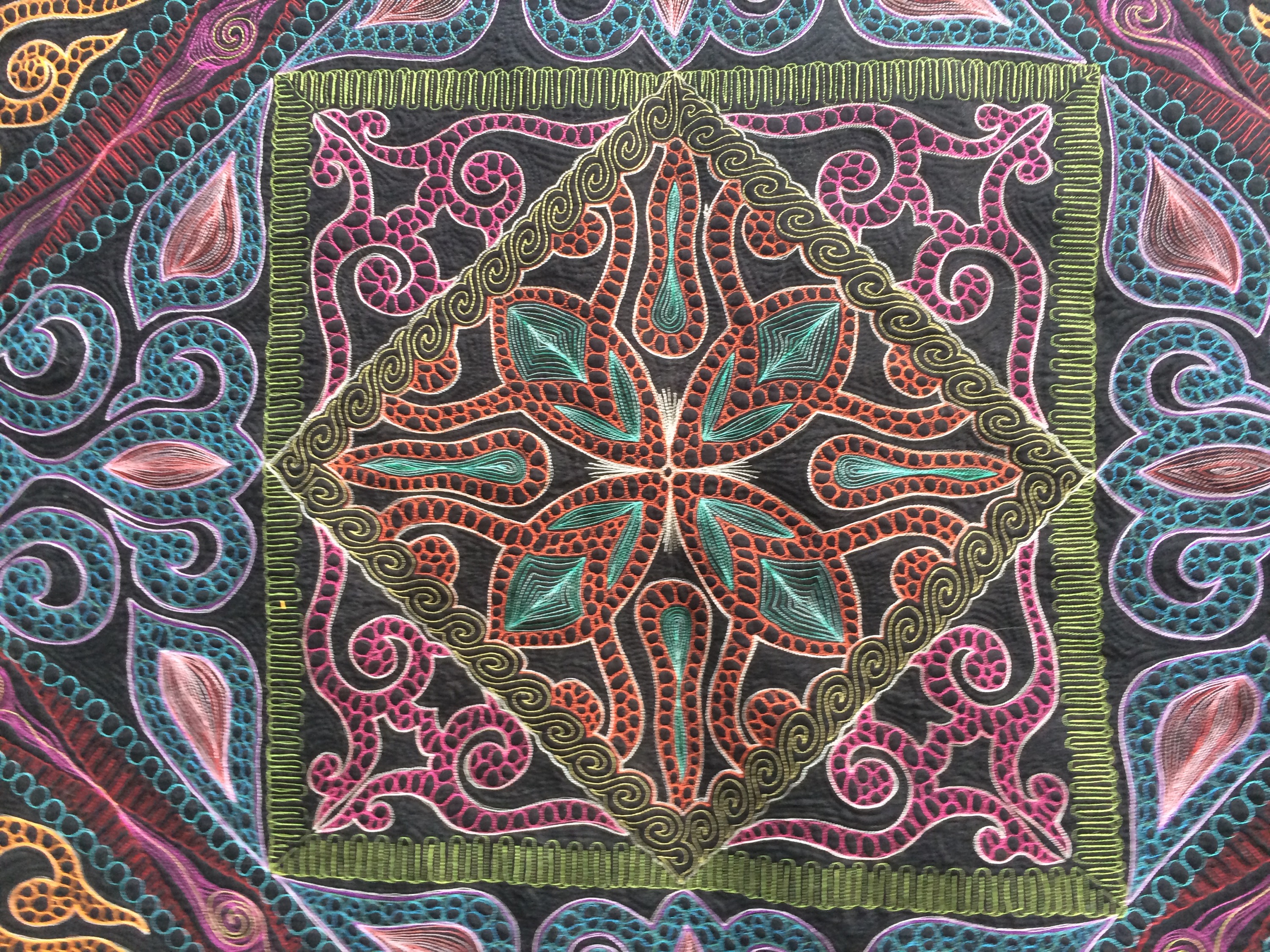
Using Jedi mind tricks (ok, not really — I traced and cut out one quadrant of it and traced that onto the quilt with chalk), and this time decided to quilt the design instead of the background. The diamond of yellow snail shapes cut through the freezer paper design, so I had to make a few modifications to get it to work well. Here it is with the center square partially quilted. I decided to use my favorite Aurifil color, #2245 in Poppy Red, a delicious red-orange color, as the center color.
Ella (see her extra thumbs?) and Stealth-Friday (look closely — he’s hard to see!) were very clear about when I had been working for too long. I think Jerry may pay them in tuna for this behavior.
When I still didn’t budge, Ella took unnecessary risks.
Eventually, the center square was done to my satisfaction.

But now what? I didn’t have leftover designs from 2012 that I could insert into the eight funky-shaped not-really-triangles that surrounded that center square. So I had to figure out how to proceed. I considered putting an octopus in each triangle, since what I had already done was so octopus-like already. And then it could be OctoOctopi.
Jerry did not like this idea. Nor did he like the angry octopus that I drew.
So then I considered drawing 7 more symmetrical (or near-symmetrical) sea creatures to go in the other triangles. I had sketches for jellyfish, turtles, stingrays, fish… Lots of possible ideas. But I’m not really a beach or ocean person so I just couldn’t get excited about proceeding.
The quilt sat dormant for several months while I tossed around possible ideas and worked on other projects. I kept looking at it, studying it, and trying to figure out what I was going to do.
And one Tuesday night, I wanted to watch TV and I didn’t have a quilt binding to sew on or any other handwork to do. So I pulled the quilt sandwich out of the pile, gathered up rulers and chalk, and headed downstairs. I sectioned off the next four triangle shapes surrounding the center square, and decided just to free-hand repeat some of the motifs from the center. Grabbing a few round things that were in the room with the TV (I think I used a coaster, and maybe the base of my wine glass), I made more hooked swirls. I marked the next border as well, but had no idea what I was going to do in those diamond spaces. I just marked them all the same so that I could decide later when I got to that point.
Suddenly I was excited about the quilt again.
But then the green I chose didn’t pop against the black the way the rest of the colors had.
So I outlined it three times in purple. Then lavender too. Still not enough.
I decided to move on and come back to it. Maybe the answer to how to make the green pop would come to me later.
So I started on the next border. I decided to repeat a stitch pattern I had done around the center square, but this time using red. It worked well.
But the diamond sections needed something, so I did pink swirls — appropriate, since I was watching “Legally Blonde” on Netflix at the time.
I still wasn’t pleased with that dark green, and now I didn’t like the pink either. But ripping either out just was too daunting. So I kept going. More time with rulers and chalk, going out towards the edges. I think I marked these during the season finale of Castle.
For the outer triangles, I decided to use orange, yellow, and bright green, rather than just a single color. I was trying to make the darker green in the middle sections work by surrounding it with power… I loved the outer triangles and how they turned out.
I spread the quilt out on the floor to see if the bright colors had brought up the dark green at all, but Friday and Ella covered AS MUCH AS POSSIBLE so that I couldn’t really see. They can be really mean and opaque when they want food.
I decided to add another color to the darker green, doubling the pebbles inside to bring down the scale of those sections and brighten them at the same time. It worked!
I fixed the pink swirls by adding a single swirl of yellow to each one all the way around in that border, and somehow, that was enough to make me like them, too.
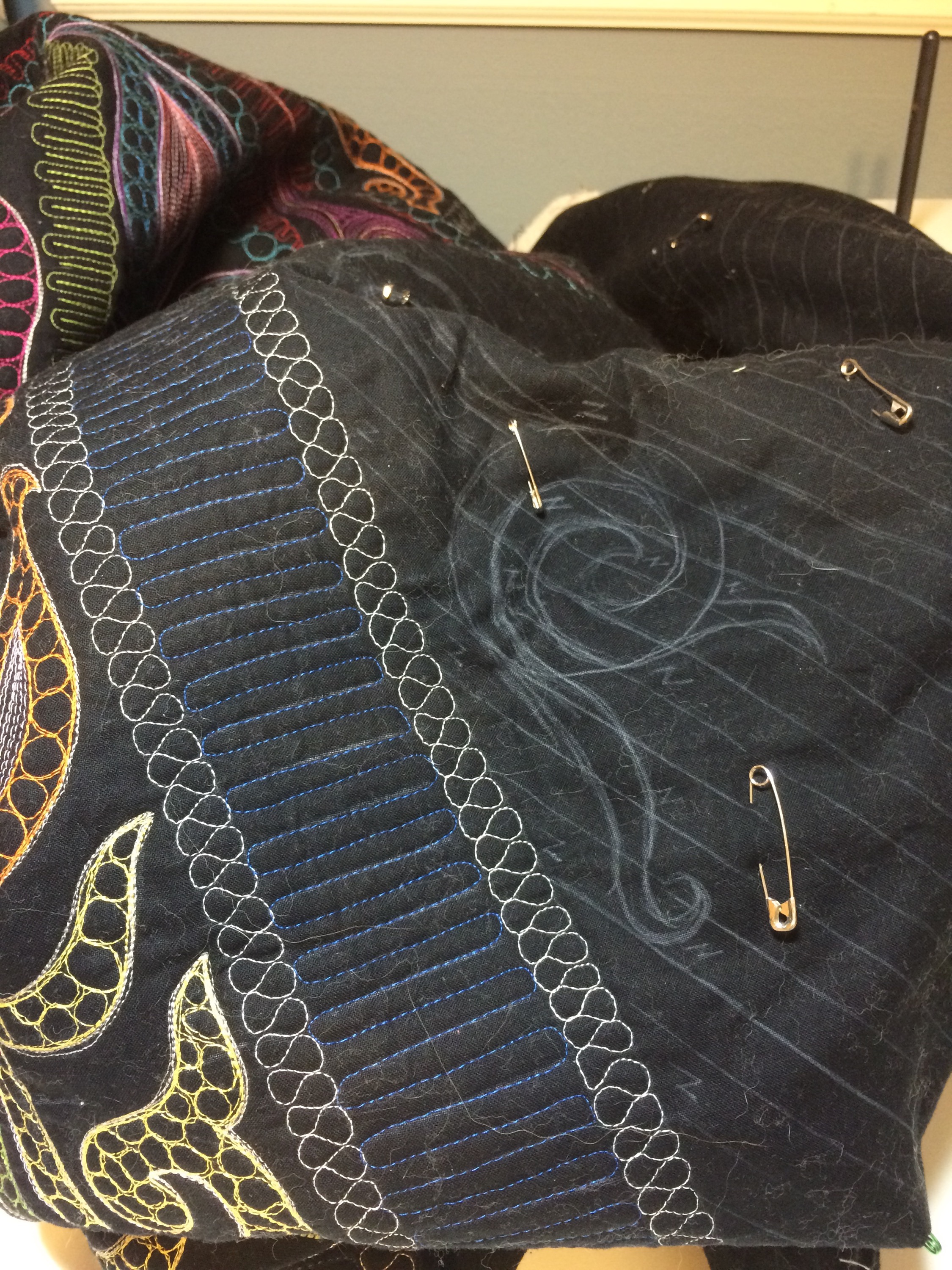
To give the eye somewhere to rest, I kept the next border very simple — just perpendicular royal blue lines every 1/4″, all the way around. It was surprisingly fast to do, too!
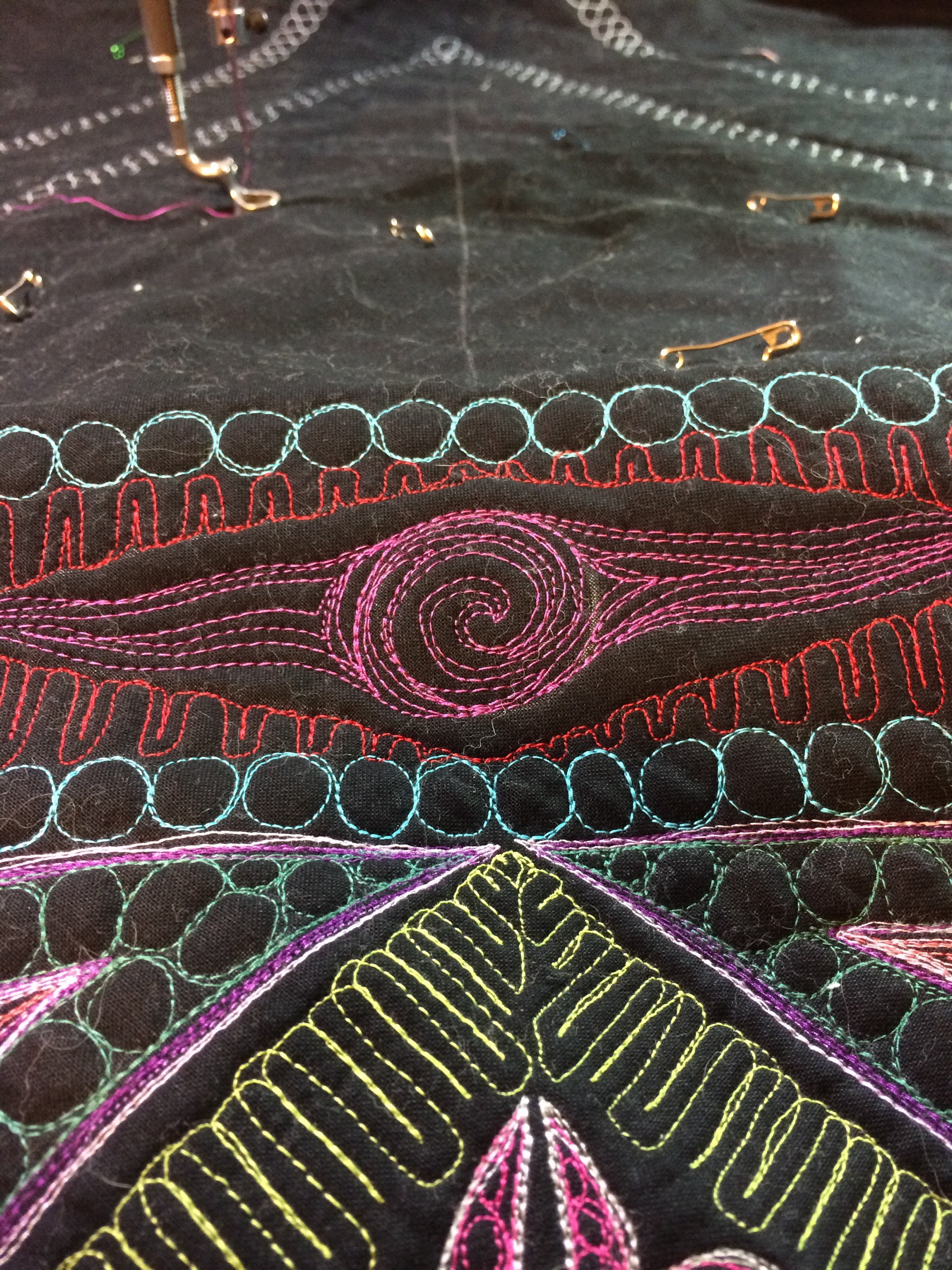
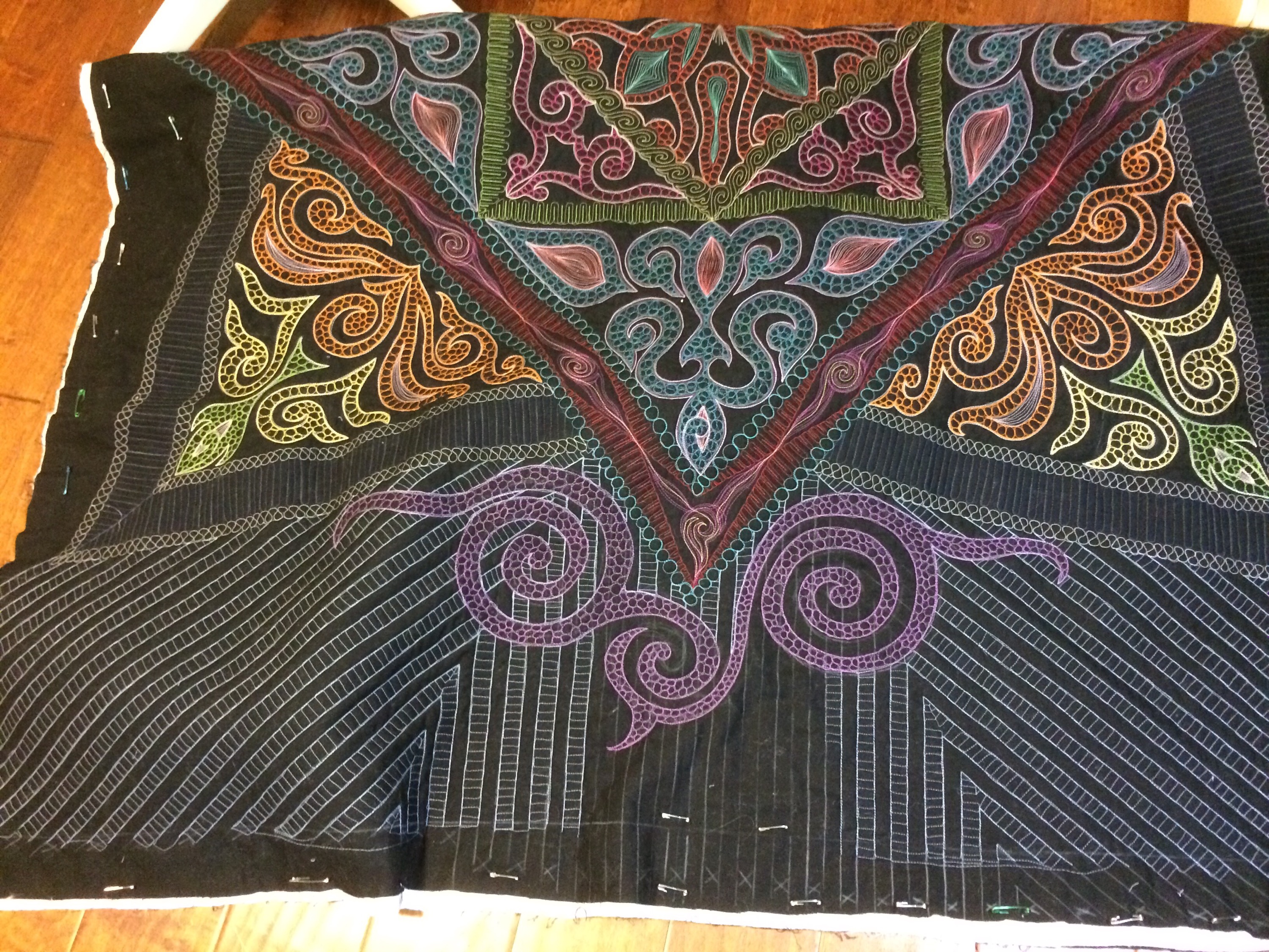
For the outer borders, I knew I wanted stripes because they had been so cool in the Big Bang quilt. So I chalked them in and started making stripes. To keep interest in the top border, I used a few bowls and quilted more hooked swirls there.
But then I hated them. They were too big. I had quilted them down with 7 outlines (1 blue, 3 magenta, 3 yellow) in my efforts to make them work, so ripping them out would be very dangerous and probably would damage the fabric. So I had to figure out a way to make them work. I was, once again, completely baffled. Conversations with Celia and with a few people on Instagram led to a suggestion that might work, but I was distracted by the end of the school year so back on the shelf it went to percolate for a few weeks.
Finally, I decided to try to rescue the quilt from UFOdom, and I chalked out the rest of the border stripes. I used a roll of Duck Tape (inside edge and outside edge) as my template for more hooked swirls on the bottom border of the quilt, to balance the ginormous ones on the top border. The “N” designation in the stripes means “NO QUILTING HERE” because I had to rip out a few times in the top border while quilting inside the swirls. Lesson learned: mark excessively.
When I got then finished, I knew that the scatter of smaller swirls across the bottom had fixed the problem and balanced the ones at the top. HOORAY!
And then binding! I consulted Helen, my Binding Color Chooser Extraordinaire (seriously — at 13 years old and possessing incredible color sense, she is the very best ever at choosing the correct color to punctuate a quilt). She recommended a simple black binding to gently frame the quilt without adding anything else to it.
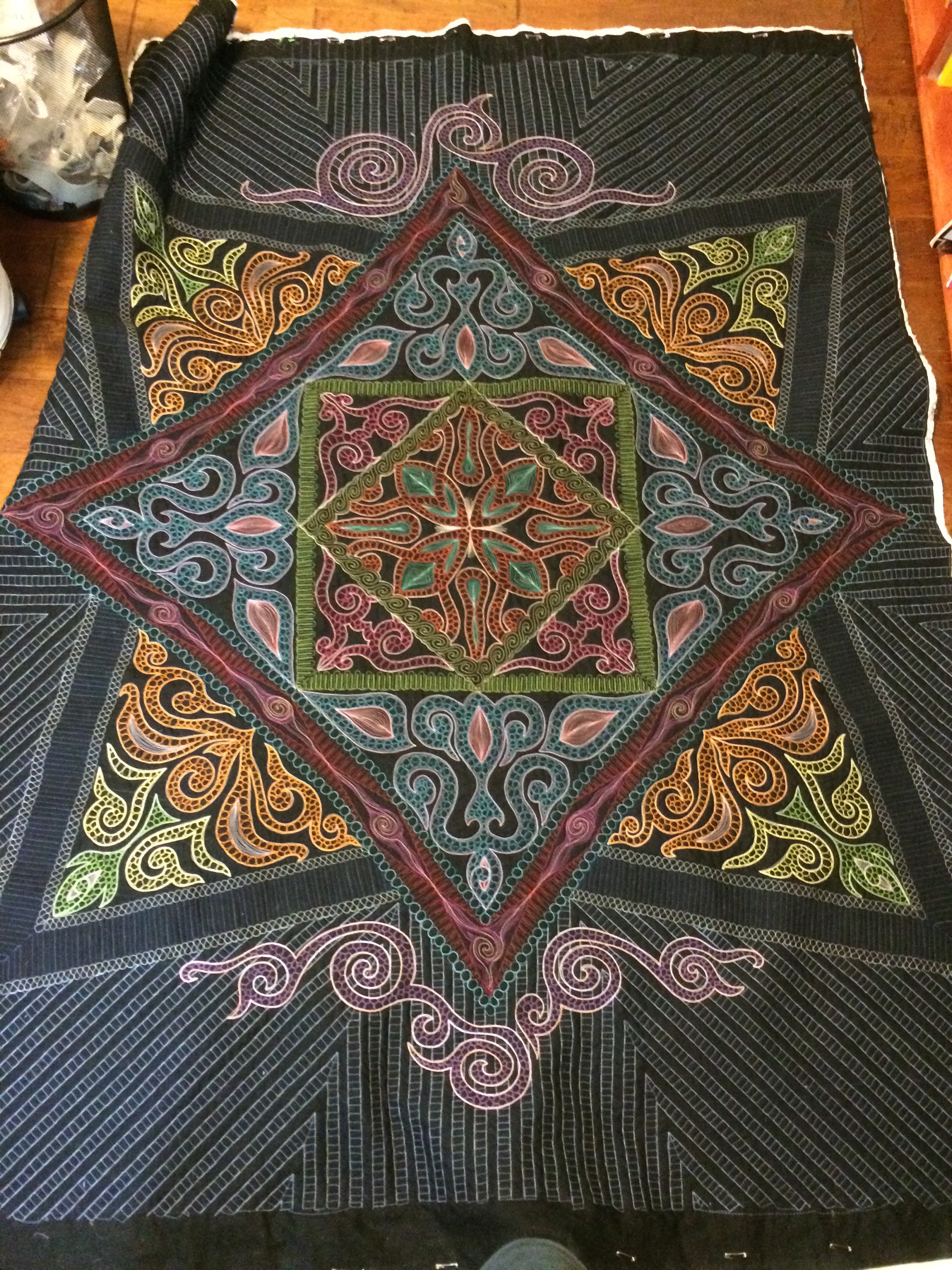
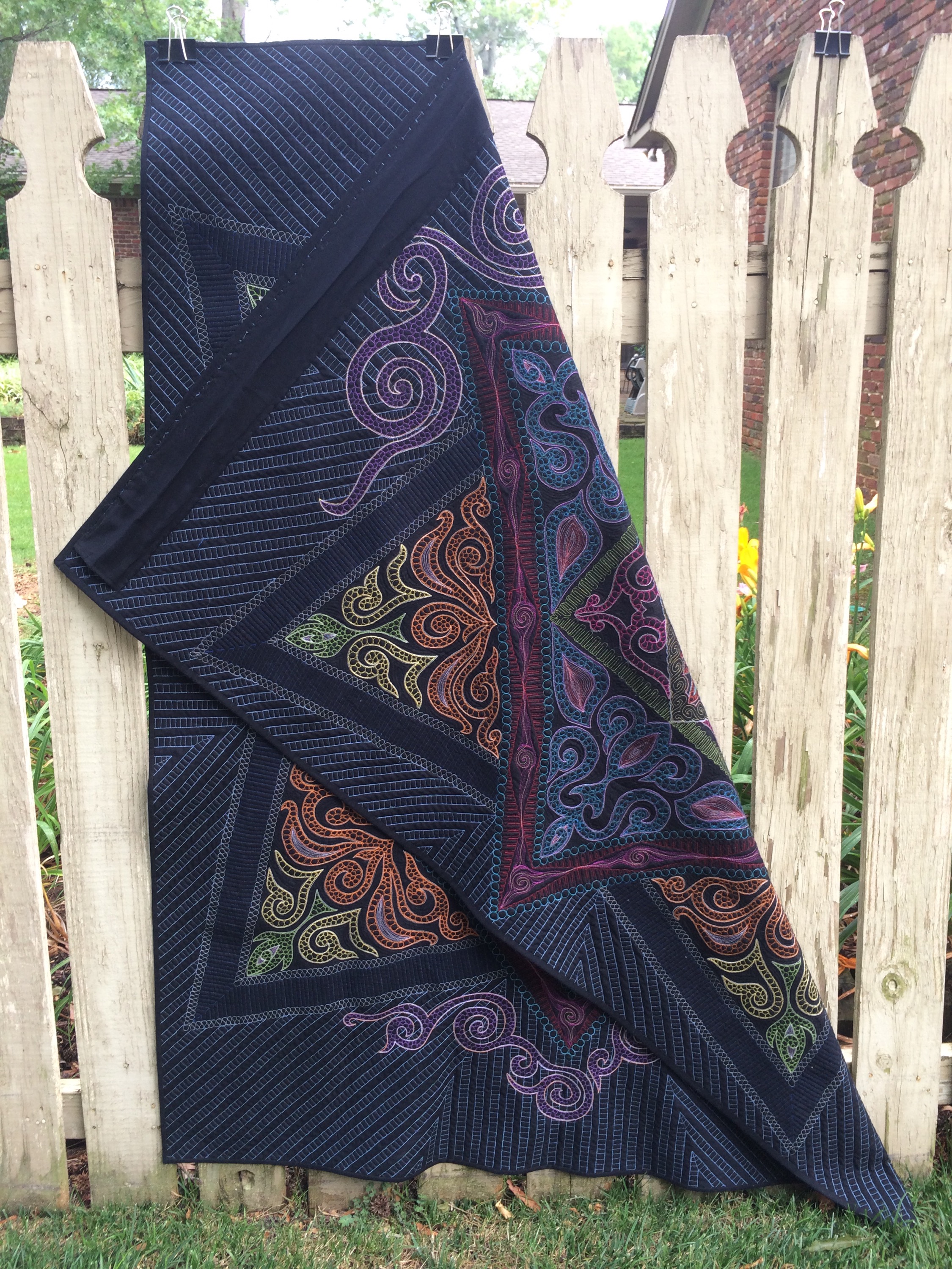
After the first of many lint-rolling efforts, I took fence photos of the finished quilt this morning. It measures at 53.5″ x 69″ and I think that’s perfect! Anything larger would have been much more difficult to handle, and much more terrifying to plan out.
Because I was so very careful about tension and always used the same thread in the bobbin, the back is almost identical to the front. The hanging sleeve and the label (yet to be attached) are the only giveaways. I love that.
My favorite things about this quilt are the work-arounds that I had to do in order to fix “problems” that happened along the way. I only ripped out stitching when tension had gone wrong, or if I got bumped by a cat or a child and stitching had gotten sent into the wrong section. Everything else I forced myself to incorporate. I also love that it appears to be totally symmetrical but there are slight differences all over because it was entirely hand-guided under the needle. I only used rulers for the marking step, and never for the quilting step. So sometimes my stitches wobble and are inaccurate, and I love the character that those imperfections bring to the piece. Even with all of the flaws, it’s still visually striking and interesting to look at. I like the idea of imperfect beauty, especially in this world where public figures are so frequently Photoshopped to achieve the looks for which they are famous.
This was an incredibly challenging piece for me and I learned a lot.
So Thank you, Natalia. I have not met you, but I continue to be inspired by your beautiful work. This quilt is a tribute to you. On the back is a label with the words “Thank you, Natalia” written in Russian… But for some reason the new update for WordPress won’t let the Cyrillic letters show up here and just includes them as question marks.




















4 Responses
Beautiful, absolutely gorgeous. You should be very proud to hang it. Thank you for sharing your process.
I enjoyed reading this story so much! Seeing the progress and process of creativity, and getting a peek into your thinking about it has been very inspiring. This is a beautiful piece of art.
Two things came to mind immediately…. (1) I’m so glad my cat is not the only one that finds the most inopportune place to lay and (b) girl got skills!!!!
Seriously you are one talented woman!!!! Impressive!!!!
**Thank you for sharing and participating in the FAL. Visiting as a member of the official 2015 Finish-Along cheerleading squad.
This quilt is a masterpiece!!!! And thanks for the many pictures. Truly, you should be bursting with pride over this quilt-it’s gorgeous!!